
Let's work together
If you want to tell your story in a compelling way that will captivate your audience and help reach your business goals, please reach out.
If you want to tell your story in a compelling way that will captivate your audience and help reach your business goals, please reach out.
23 Esquire Road, Billerica
23 Esquire Road, Billerica
23 Esquire Road, Billerica
Service
UI
Property Branding
Publication
Service
UI
Property Branding
Publication
Client
Colliers
Overview
Property branding and a print and digital marketing campaign for a 136,000 SF Flex/R&D Manufacturing Building. The goal was to position this Billerica industrial property as a powerful, accessible, and customizable space that can adapt to the needs of it's tenant.
Overview
Property branding and a print and digital marketing campaign for a 136,000 SF Flex/R&D Manufacturing Building. The goal was to position this Billerica industrial property as a powerful, accessible, and customizable space that can adapt to the needs of it's tenant.
Overview
Property branding and a print and digital marketing campaign for a 136,000 SF Flex/R&D Manufacturing Building. The goal was to position this Billerica industrial property as a powerful, accessible, and customizable space that can adapt to the needs of it's tenant.
Tools
Illustrator
InDesign
Figma
Ceros
Marketing Cloud
Tools
Illustrator
InDesign
Figma
Ceros
Marketing Cloud

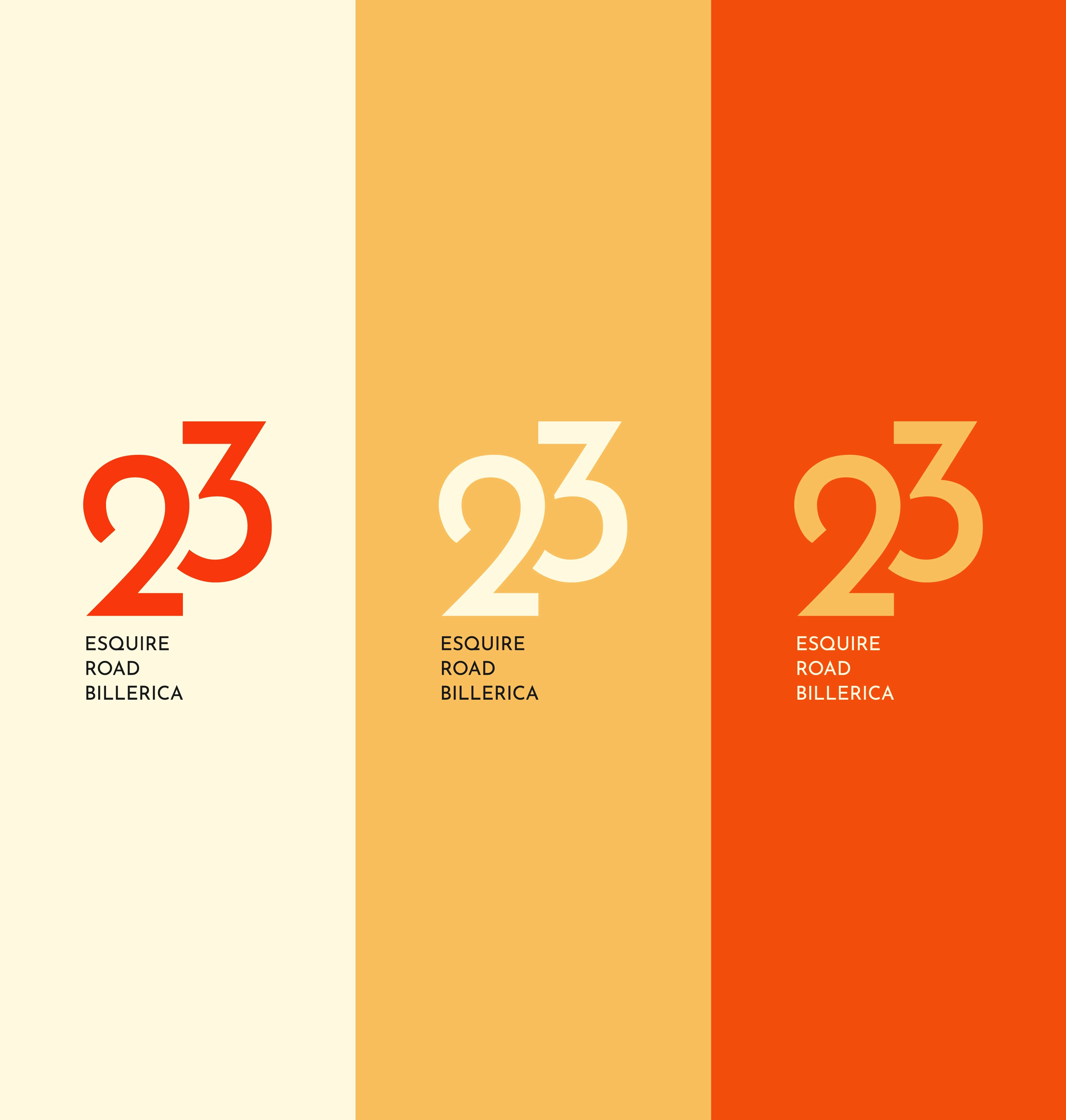


Situated right off of Route 3 between i95 and i495, 23 Esquire is positioned to be a manufacturing hub between 3 major transportation routes. The logo represents that position. The street and town names serve as a grounded base while the 2 and the 3 implies movement through their diagonal layout. Placing the 3 above the 2 allowed for cutting the edges of the 3 to follow the rounded path of the 2, creating negative space that pushes the viewers' eyes forward.
Situated right off of Route 3 between I-95 and I-495, 23 Esquire is positioned to be a manufacturing hub between 3 major transportation routes. The logo represents that position. The street and town names serve as a grounded base while the 2 and the 3 implies movement through their diagonal layout. Placing the 3 above the 2 allowed for cutting the edges of the 3 to follow the rounded path of the 2, creating negative space that pushes the viewers' eyes forward.


The brochure is a key component to this campaign. It implements the brand through the swooshing motion across the front cover that reveals the building underneath - and has clear section structure and hierarchy that guides the reader through the building specifications and information.
The brochure is a key component to this campaign. It implements the brand through the swooshing motion across the front cover that reveals the building underneath - and has clear section structure and hierarchy that guides the reader through the building specifications and information.
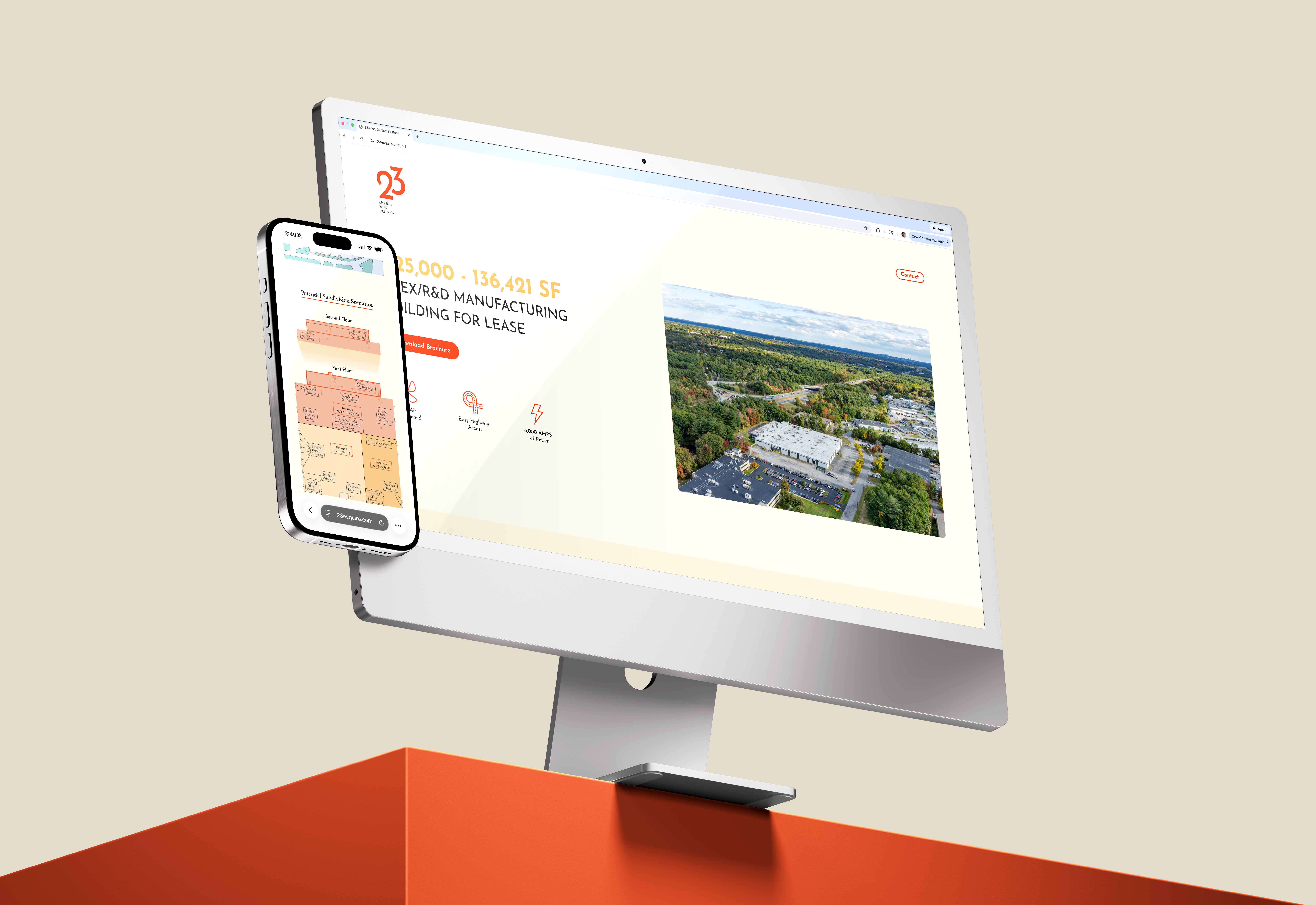


The website offers a digital breakdown of the property, it's qualifications, and similar tenants in the marketplace. Light animation engages the viewer, guiding their attention.

The website offers a digital breakdown of the property, it's qualifications, and similar tenants in the marketplace. Light animation engages the viewer, guiding their attention.
Wider Campaign
In addition to the brochure and website, I also created a recurring E-Blast sent to cooperating brokers as well as a postcard and golf ball that were sent to perspective clients.
Wider Campaign
In addition to the brochure and website, I also created a recurring E-Blast sent to cooperating brokers as well as a postcard and golf ball that were sent to perspective clients.
Wider Campaign
In addition to the brochure and website, I also created a recurring E-Blast sent to cooperating brokers as well as a postcard and golf ball that were sent to perspective clients.


More Projects
More Projects

Real Estate Photography
Real Estate Photography
PHOTOGRAPHY


Colliers Holiday Royale
Colliers Holiday Royale
Colliers Holiday Royale
EVENT BRANDING
ILLUSTRATION
ENVIRONMENTAL
EMAIL CAMPAIGN
SOCIAL