Port Charlotte
ADVERTISING
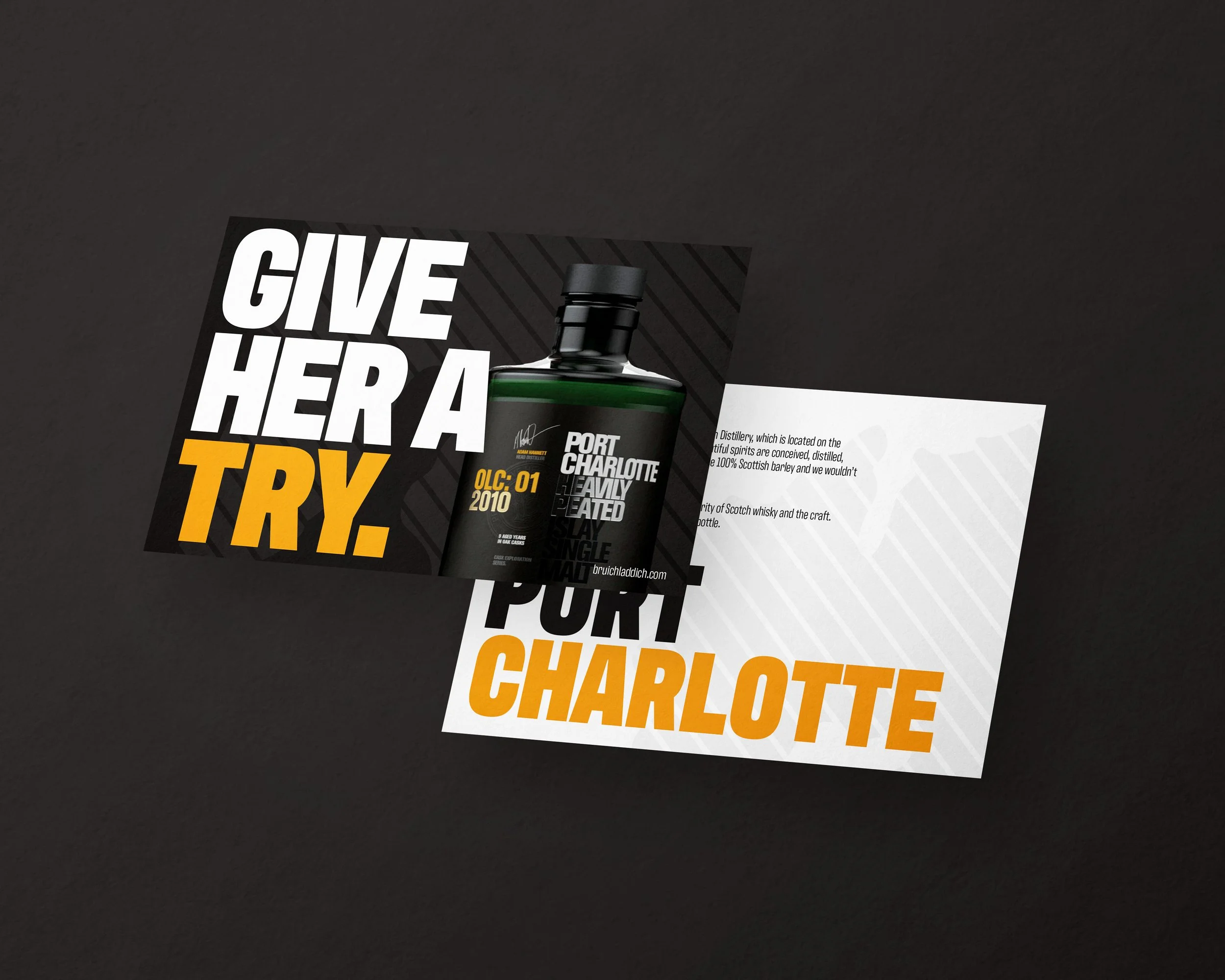
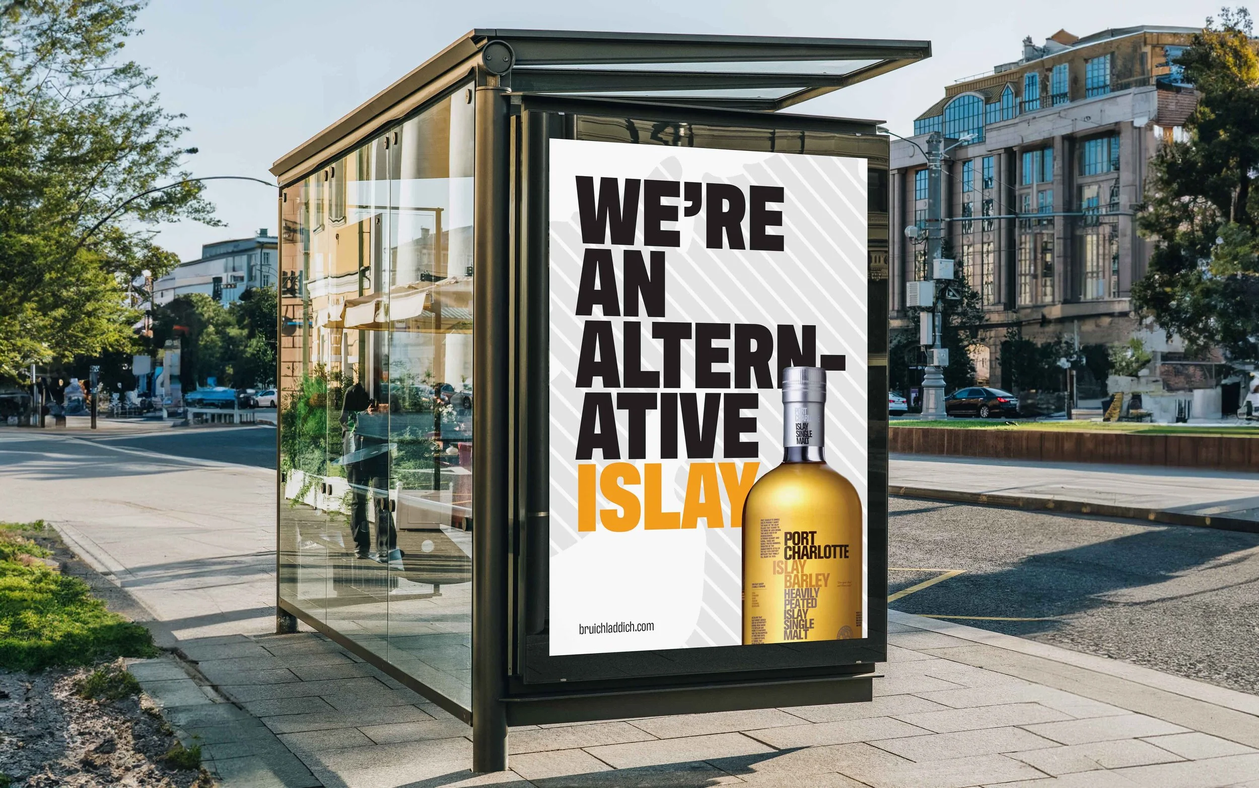
Fictional advertising for the scotch whisky brand, Port Charlotte.
Port Charlotte is a heavily peated Scotch whisky produced by Bruichladdich, a scotch distiller based on the Scottish island of Islay. Bruichladdich was re-opened in 2001 and since then, they’ve contributed to the local community, have taken inspiration from environment and, perhaps most importantly, they’ve kept the vast majority of their operations on Islay.
The point of this advertising campaign is to explain why
Port Charlotte is a brand of the people.
A very Scottish way of expressing the beauty of something is to refer that object or place as “She” and “Her”. The Bruichladdich distillers admire the beauty and strength of their products so much that they refer to them as “She” and “Her”. Integrating this language in the advertising emphasizes how high Port Charlotte stands above her competition.
A signature feature of Islay scotches is the use of the island’s peat in their production, which gives the whisky a very smokey and charcoal-like taste and smell. Those who like this flavor profile really love it and have become Port Charlotte’s target audience. As a result, it’s important to showcase the peaty nature of the whisky by putting it front-and-center in the marketing.
The typography throughout the campaign is a bold san-serif font that takes up a lot of the space on each layout. The leading is very small as well, creating a wall of text. This emulates the Port Charlotte branding and text treatment on the packaging. Creating a block of text particularly in the Instagram ads uses symmetry to establish a connection between the words and the subject of the photography.


