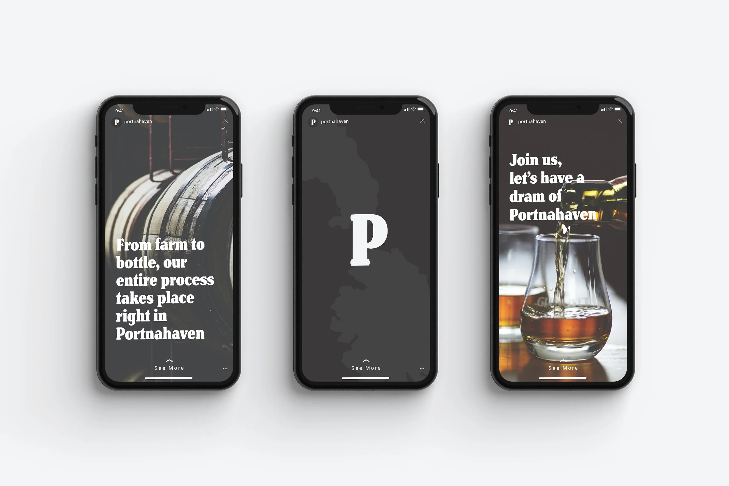
Portnahaven
BRANDING PACKAGING
A fictional Scotch whisky brand based in Portnahaven, a small village on the Scottish island of Islay.
Portnahaven is a small village on the southwestern corner of Islay. The island is famous for producing smokey whisky by using peat, organic material found along the bogs of Islay, in the distilling process. The Portnahaven brand lives up to this legacy.
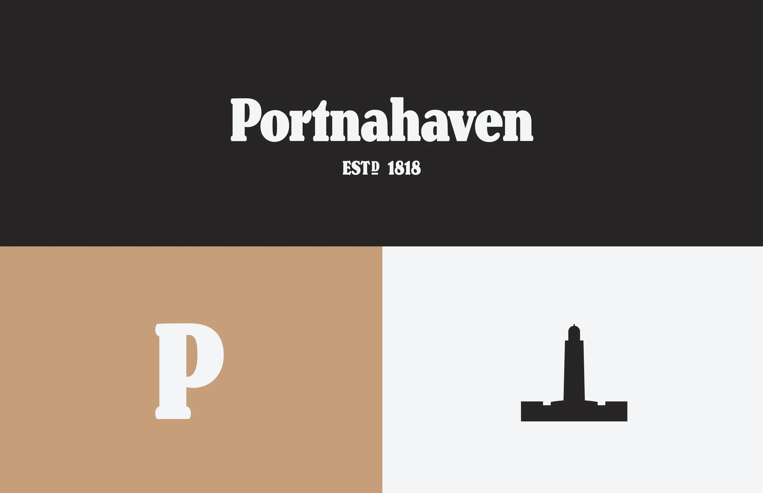
The Portnahaven logo is a simple wordmark that utilizes the organic curves and heavy nature of Henriette Compressed Black to emphasis the brand’s identity of a no nonsense, completely natural whisky that has been around for over 200 years.
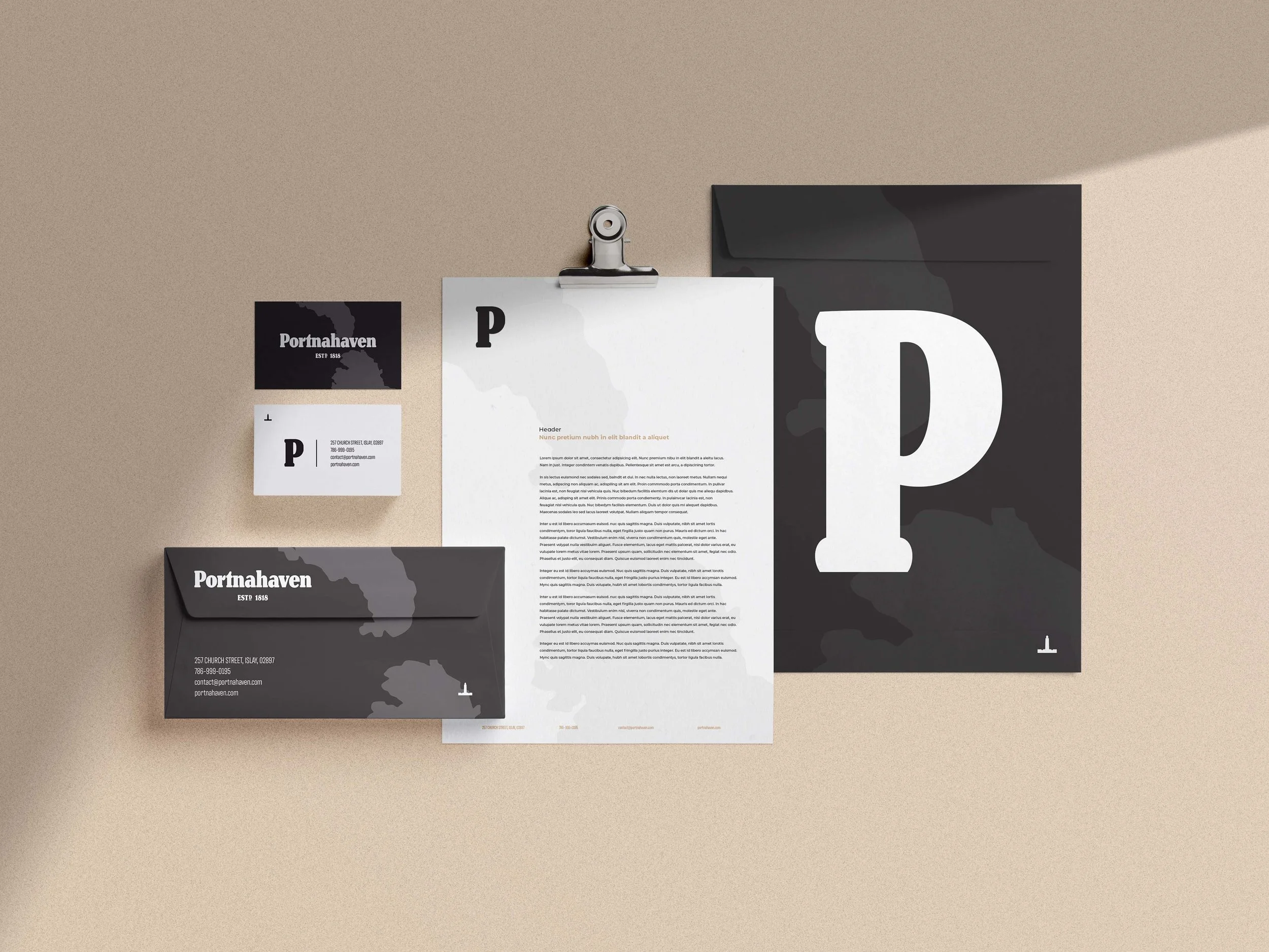
The two islands, Eilean Mhic Coinnich and Orsay, are featured throughout the branding due to their significance to the area. They sit right in front of the port town of Portnahaven. While the islands are uninhabited, they’ve proved vital to the town’s survival. The islands protect the little town from strong North Atlantic winds and allowed Portnahaven to thrive.
The short, clear bottle was specifically chosen to allow customers to easily hold the product in one hand while they read the label and view the beautiful natural color of the whisky. This creates engagement with the customer, which is key to being chosen from a full shelf of competitors.
The packaging was designed for Scotch enthusiasts who want to know exactly what they’re buying. Bold and centered text emphasizes the bottle is cask strength. A golden number “10” highlights how long the whisky has been aging. The dark background color and illustration of the islands off Portnahaven call back to the earthy peat used to create this spirit.


